YouTube Changes Its Logo and App Design
Just like bunch of other apps YouTube changed its logo and app design to avoid common logo mistakes. The changes include new logo, typeface, color scheme and some other stuffs on the look. After the last 12 years using the same logo, YouTube finally makes an evolution out of it.
YouTube kicked out the word Tube out of the iconic red tube. The change not just happened on the Tube’s tube but also brought the familiar play button as the icon. The play button pretty much signifies the whole image of the brand. Besides for its familiarity, the play button icon simply represents the whole family services YouTube has now.
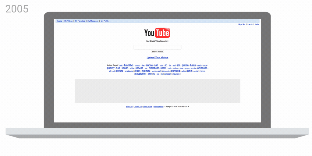
YouTube’s desktop website evolution
However all of the changes don’t change YouTube’s mission. YouTube wants to give people a voice and show them the world – no matter what device they use. Of course this mission seems like what everyone wants to believe and so we hope the best for YouTube.
Leave a Reply