App Store New Logo Might Got You in The Mood for Ice Cream Bar
App Store just introduced logo redesign for the first time after years of same signature drawing tools.
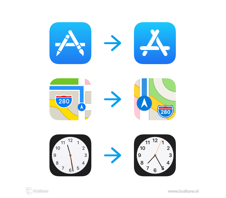
Just a few days ago, Apple released it’s sixth developer beta for iOS 11. As a part of the release, Apple also introduced new icons for Maps and AirPod animations. One thing that got more attention other than those renewal is the redesign of App Store logo. What’s so eye-catching about it is that the App Store new logo might get you in the mood for an ice cream bar.
The new icon now looks pretty significant because it replaces the ruler-pencil-paintbrush trio with popsicle sticks. It is quite unexpected why Apple did this but maybe they encountered some logo design mistakes sleek letterform seems more satisfying. However, people have different thoughts about the new logo, right?
Alongside the new logo, Apple also features bug-fixes and performance upgrades on the App Store. The new logo design of the Apple apps look better at high resolution which is great. Furthermore iOS 11 brings change to Card and Clock as well. Take a look!

Can l get information about how they did this? (thought process)
Ugh… Three sticks? Seriously? I’m all for minimalism, but this is awful.